Health Promotion Agency – environmental graphics
HPA had moved into a new office space that needed colour and personality on the walls, within a tight budget.

HPA’s purpose is to ‘Inspire all New Zealanders to lead healthier lives’ and so the idea for their head office was to use wall graphics to not only enhance the working environment, but through this, contribute to staff wellbeing.
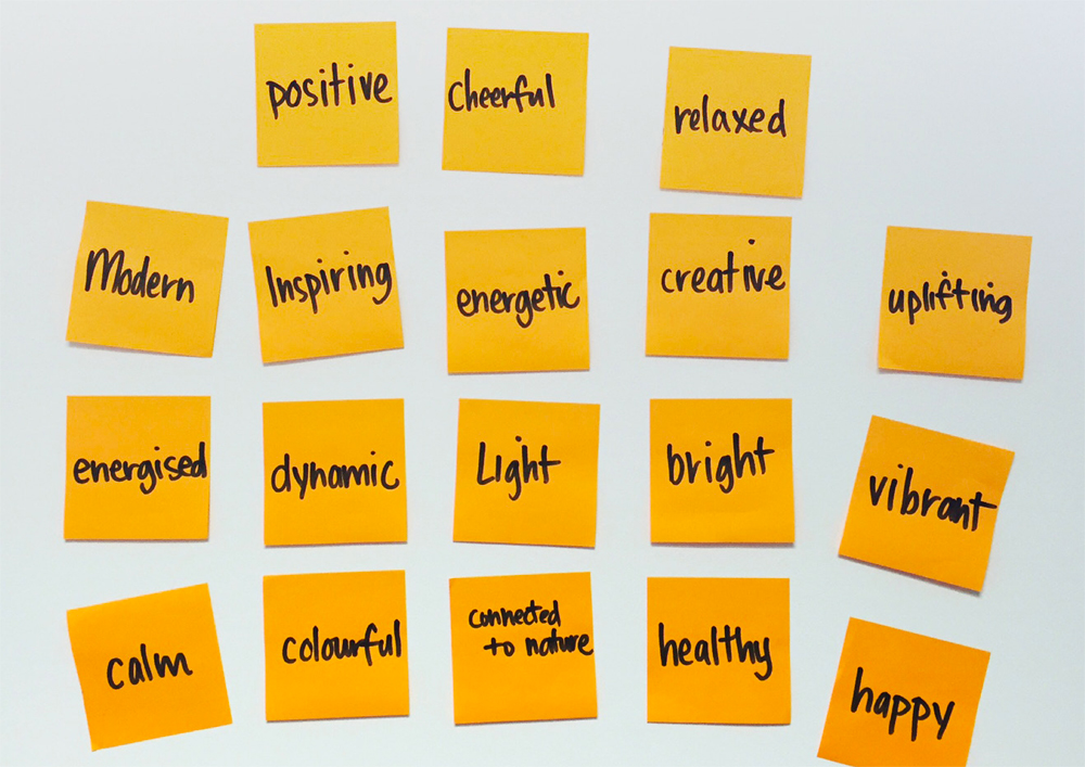
Staff contributed to the design brief, specifying how they wanted their environment to feel:

A simple illustration style was chosen as it was simple to execute, cost effective and fluid enough to suit the building’s various zones.

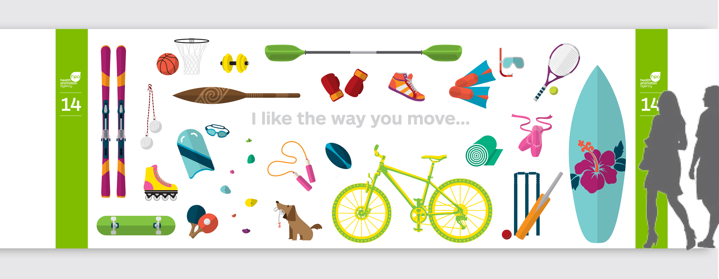
A long hallway presented an opportunity to encourage staff to role model healthy lifestyles.

The design solution for the small meeting rooms (named after New Zealand towns) was to create the illusion of more space by creating vistas, typical of those towns, through illustrated ‘windows’.

Other objects also help enhance the rooms – like gum boots and an umbrella for typically wet Hokitika and a beach umbrella and ball for sunny Ahipara.


Kitchen areas are brightened up with large-scale illustrations of fruit.

The organisation’s mission statement is displayed at reception.

Break-out meeting areas were made to feel like a lounge at home, with comfortable furnishings, and vibrant wall graphics.


“Margie is a one-woman ‘trust fall’... I’ve worked with Margie on brand projects for many years; she successfully invents and reinvents brands with an unashamed abundance of enthusiasm and charm!”
